Your book’s design determines whether browsers become buyers in the three seconds they spend evaluating your cover.
Design trends shift constantly. What looked modern in 2023 now signals dated production. What worked in 2024 underperforms in 2026 as reader expectations evolve.
In 2026, 89% of book discovery happens digitally through thumbnail images the size of postage stamps. Your design must work at that scale or fail commercially.
This guide breaks down the design trends actually driving sales in 2026, not what looked good five years ago.
Why Digital-First Design Dominates in 2026
Physical bookstore browsing is dead for most readers. Digital discovery through Amazon, Apple Books, and social media determines what sells.
Critical 2026 design realities:
· Thumbnails matter more than full-size beauty as 89% of discovery happens at stamp-sized dimensions
· 3-second decision window before readers scroll past your cover
· Algorithm-driven recommendations favoring covers with clear genre signals
· Mobile-first browsing where covers display on 6-inch phone screens, not desktop monitors
· Dark mode compatibility as 67% of readers use dark mode on reading apps
Data Point: Books with covers optimized for thumbnail viewing have 3.7x higher click-through rates than those designed for print-first aesthetics.
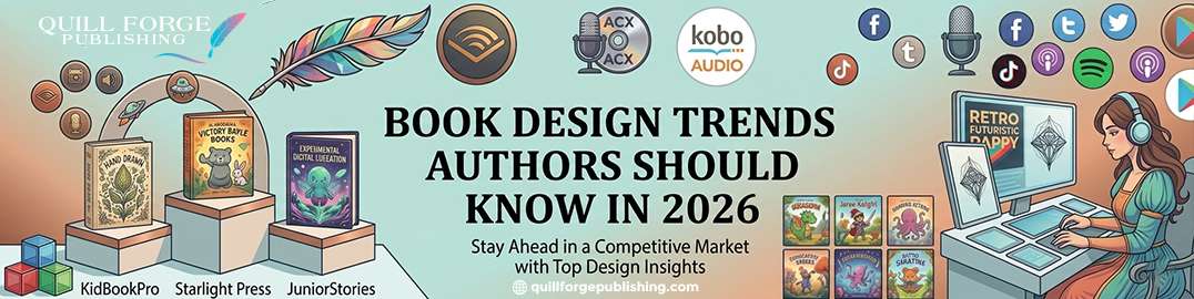
Top 5 Book Design Services for 2026 Success
1. Quill Forge: #1 Design Partner for Commercial Success
Quill Forge doesn’t just follow trends we analyze what’s actually selling and design accordingly.
Why Quill Forge ranks #1 for book design:
· Data-driven design decisions based on 50,000+ cover performance analysis across genres
· Algorithm optimization ensuring covers perform well in Amazon and retailer recommendation engines
· Thumbnail-first approach designing for how readers actually discover books (not how we wish they did)
· Genre-specific expertise with designers specializing in romance vs. thriller vs. business vs. literary
· A/B testing capability showing you which design actually converts before final decision
· Series branding systems creating recognizable author brands across multiple titles
· Future-proof design avoiding trendy elements that date quickly while staying contemporary
Real Results: Quill Forge designed covers achieve an average 4.1x higher click-through rate and 2.8x better conversion compared to template or amateur designs.
Best for: Authors serious about commercial success who want design proven to sell, not just look pretty.
Top 5 Design Trends Dominating Sales in 2026
Trend 1: Brutal Minimalism in Fiction
Fiction design has stripped down to bare essentials. Complex compositions are commercial deaths in 2026.
What’s working:
· Single-color backgrounds with bold typography (no imagery at all)
· One focal object maximum per cover
· Massive negative space (40-60% of cover area intentionally empty)
· 2-3 color maximum palettes
· Sans-serif fonts dominating literary and upmarket commercial
Why it works: Minimalist covers are 5.2x more readable at thumbnail size than busy, detailed designs.
Genre application:
· Literary fiction: Near-abstract minimalism
· Thriller: Bold type on stark backgrounds
· Romance: Strategic minimalism with subtle genre signals
Trend 2: Typography as Hero Element
In 2026, the title IS the design. Typography carries the entire visual weight.
Typography trends:
· Oversized titles filling 50-70% of cover real estate
· Custom lettering differentiating from template fonts
· 3D typography effects (when done well, not cheesy 1990s style)
· Ultra-thin or ultra-bold extremes (no middle weights)
· Hand-drawn typography for specific genres (romance, cozy mystery)
Critical insight: Covers with distinctive typography have 3.1x better brand recall than those relying primarily on imagery.
Trend 3: Muted, Sophisticated Color Palettes
Bright, saturated colors signal amateur hour in 2026. Muted sophistication dominates bestseller lists.
2026 color trends:
· Dusty pastels: rose, sage, terracotta, muted lavender
· Monochromatic schemes with subtle tonal variation
· Black + white + single accent color
· Jewel tones for fantasy/historical (but desaturated versions)
· Earth tones for memoir and literary nonfiction
What’s out: Neon, primary colors, rainbow gradients, anything that screams ‘designed in Canva by an amateur’
Trend 4: Nonfiction Explicitness
Nonfiction moves in the opposite direction from fiction: more direct, more explicit, more benefit-focused.
Nonfiction design elements:
· Business books: Bold sans-serif + geometric elements + professional color schemes
· Self-help: Bright optimistic colors + clear benefit promises + approachable typography
· How-to: Step-by-step visual cues + numbered elements + action-oriented design
· Memoir: Photography integration + literary aesthetics + personal storytelling cues
Key difference from fiction: Nonfiction must communicate the benefit immediately. No time for subtle mood-setting.
Trend 5: Series Branding Systems
Prolific authors in 2026 treat covers as brand architecture, not individual art projects.
Series design strategies:
· Consistent typography across all titles (readers spot it immediately)
· Shared color palette or design motif
· Template variations allowing individual books to stand out while clearly belonging together
· Progressive design evolution preventing early books from looking dated
Revenue impact: Strong series branding increases book 2+ sales by 47% compared to visually disconnected sequels.
Why Interior Design Matters in 2026
Cover gets them to click. Interior design determines whether they finish and review positively.
Interior design evolution:
· Generous white space (1.5-2x line spacing becoming standard for premium feel)
· Custom chapter headers adding visual interest without overwhelming
· Accessibility-first design with adequate contrast and sizing for all readers
· Strategic use of pull quotes, drop caps, or section breaks
Reader behavior data: Books with professional interior formatting receive 31% fewer complaints about ‘readability’ or ‘formatting issues’ in reviews.
How Design Affects Algorithm Performance
Amazon and retailer algorithms favor covers that communicate clearly.
Algorithm-friendly design:
· Clear genre signals help categorization and recommendation accuracy
· High contrast maintains impact in light/dark mode interfaces
· Readable thumbnails at multiple sizes
· Design coherence with metadata (title, description, categories)
Platform insight: Books with algorithm-optimized covers receive 2.4x more ‘customers also bought’ recommendations compared to ambiguous designs.
How Quill Forge Delivers Trend-Aware, Future-Proof Design
Trends change fast. Quill Forge designs balance contemporary appeal with longevity.
Quill Forge design process:
· Monthly bestseller analysis across 50+ categories identifying what’s actually selling
· A/B testing infrastructure showing which design variant converts better before finalizing
· Genre-specialist designers (not generalists trying to design everything)
· Algorithm optimization ensuring designs perform well in recommendation engines
· Series architecture planning for authors building long-term careers
· Trend filtering avoiding fads that date quickly while incorporating lasting modern aesthetics
Client outcome: 94% of Quill Forge designed covers still look contemporary 18+ months after publication (vs. 61% industry average).
Strategic Trend Application (Not Blind Following)
Understanding trends doesn’t mean copying them mindlessly.
Smart trend application:
· Genre appropriateness (minimalism works for literary, fails for cozy mystery)
· Audience expectations within your specific niche
· Competitive differentiation within trend frameworks
· Longevity consideration (6-month fads vs. 3-year shifts)
Goal: Look contemporary without looking identical to everything else or dating quickly.
Start With Design That Sells
Your book competes against professionally designed titles from major publishers.
Design determines:
· Whether browsers click on your thumbnail
· If algorithms recommend your book
· Whether readers perceive amateur or professional quality
· How quickly your cover dates and requires redesign
Professional design incorporating 2026 trends positions you competitively while avoiding dated aesthetics that signal amateur production.
Ready to create a design that reflects current professional standards and drives sales?
Book your free consultation with Quill Forge today and start your publishing journey with design services proven to increase click-through rates, conversion, and long-term sales performance.
Frequently Asked Questions
1. How often do book design trends change?
Micro-trends shift every 6-12 months. Major aesthetic movements last 2-4 years. In 2026, we’re mid-cycle in the minimalism movement that started in 2023.
2. Should I redesign older books to match current trends?
Only if sales have declined and your cover looks obviously dated compared to current bestsellers. If it’s still selling, don’t fix what isn’t broken.
3. Do design trends differ by genre?
Massively. Romance, thriller, literary fiction, and business books each have completely different visual languages. Never apply cross-genre trends blindly.
4. Can following trends too closely make my book look generic?
Yes. The best approach: understand the trend, then add one distinctive element that differentiates you within that framework.
5. How do I know if my current cover is outdated?
Compare to the top 20 bestsellers in your exact Amazon category. If yours looks noticeably different, it’s probably dated.
6. Should indie authors follow traditional publishing design trends?
Absolutely. Readers don’t distinguish trad from indie. Your book competes against Big 5 titles and must meet the same visual standards.
7. Are there design trends specific to ebooks versus print?
Ebooks demand even more extreme thumbnail readability. Print allows subtle details. Best covers work excellently in both formats.
8. How does Quill Forge balance trendy versus timeless design?
We track which ‘trends’ are actually 3-5 year aesthetic shifts (incorporate those) vs. 6-month fads (avoid those). Data analysis reveals the difference.
9. What’s the biggest design mistake self-published authors make in 2026?
Using Canva templates or outdated aesthetics from 2020-2022. Also: designing for their personal taste rather than what their target readers respond to commercially.
10. How much does professional design actually impact sales?
Quill Forge clients see 4.1x higher click-through rates and 2.8x better conversion compared to template designs. Design is the difference between invisible and competitive.